Whatever you think the answer is to the question posed in the title, I'd guess that that your estimate is way off. Mine sure was as I was seduced by a promiscuous factoid. Enjoy!
How Many People Have Ever Lived On Earth? 108 Billion
A new paper is out today in the American Sociological Review (here by subscription) by Gordon Gauchat titled "Politicization of Science in the Public Sphere: A Study of Public Trust in the United States, 1974 to 2010." Here is the abstract:
This study explores time trends in public trust in science in the United States from 1974 to 2010. More precisely, I test Mooney’s (2005) claim that conservatives in the United States have become increasingly distrustful of science. Using data from the 1974 to 2010 General Social Survey, I examine group differences in trust in science and group-specific change in these attitudes over time. Results show that group differences in trust in science are largely stable over the period, except for respondents identifying as conservative. Conservatives began the period with the highest trust in science, relative to liberals and moderates, and ended the period with the lowest. The patterns for science are also unique when compared to public trust in other secular institutions. Results show enduring differences in trust in science by social class, ethnicity, gender, church attendance, and region. I explore the implications of these findings, specifically, the potential for political divisions to emerge over the cultural authority of science and the social role of experts in the formation of public policy.
The paper explores public trust in institutions of science and looks at differences among groups who self-identify into different political categories. The paper explores three hypotheses that exist in the academic literature related to the relationship of the public and scientific institutions. They are:
"The cultural ascendency thesis predicts a uniform increase in public trust in science across all social groups. In other words, the special congruence of science and modern institutions increases the need for scientific knowledge and public education, which, in turn, encourages public trust in science"
"By contrast, scholars have predicted a uniform decline in public trust across all social groups, or the alienation thesis. This decline in public trust is associated with a cultural backlash against technocratic authority and science’s inability to defend itself against its own standards in public discourse"
"Finally, the politicization thesis predicts that ideological conservatives will experience group-specific declines in trust in science over time. Conservatives’ distrust is attributable to the political philosophy and intellectual culture accompanying the [new right] and the increased connection between scientific knowledge and regulatory regimes in the United States, the latter of which conservatives generally oppose."
Here is the bottom line of the paper's empirical analysis:
To summarize the main empirical findings, this study shows that public trust in science has not declined since the 1970s except among conservatives and those who frequently attend church. Accordingly, the analysis provides negligible evidence for the cultural ascendency thesis, which suggests that trust in science will increase over time. Nor do results support the alienation thesis that predicts a uniform decline in public trust in science. In general, results are consistent with claims of the politicization thesis and show that conservatives experienced long-term group-specific declines rather than an abrupt cultural break. Additionally, one of the key findings here involves the relationship between education and trust in science. In essence, this study greatly complicates claims of the deficit model, which predicts that individuals with higher levels of education will possess greater trust in science...
These conclusions mirror more broadly the dynamics that I discuss in The Climate Fix that have occurred in the case of climate change -- the perspectives of Democrats and Republicans have diverged dramatically on the issue as it has become more politicized. And just as in the case of climate change, the paper's conclusions are not about science per se, but about public views of the legitimacy of science institutions in politics:
...conservatives’ unfavorable attitudes are most acute in relation to government funding of science and the use of scientific knowledge to influence social policy (see Gauchat 2010). Conservatives thus appear especially averse to regulatory science, defined here as the mutual dependence of organized science and government policy. . .
Paradoxically, it is possible that science’s cultural authority engendered politicization, particularly its role in policy formation and regulation of private interests. This assumes that science’s cultural authority has grown—especially among legal, political, and economic institutions (see Jasanoff 2004)—to the point that the scientific community inevitably becomes entangled in polarized conflicts (e.g., economic growth versus environmental sustainability).
As a result, science is “increasingly seen as being politicized and not disinterested” (Yearley 2005:121). Although public distrust in science may not portend systemic crisis, social scientists, policymakers, and scientific organizations should remain concerned about public perceptions.
The paper provides a nice set of empirical evidence to support the arguments that have been made by Dan Sarewitz (and others) about the consequences of the politicization of the scientific community. Writing in Slate last year, Sarewitz explained the basic dynamics at play here using the case of climate change:
Think about it: The results of climate science, delivered by scientists who are overwhelmingly Democratic, are used over a period of decades to advance a political agenda that happens to align precisely with the ideological preferences of Democrats. Coincidence—or causation? Now this would be a good case for Mythbusters.
During the Bush administration, Democrats discovered that they could score political points by accusing Bush of being anti-science. In the process, they seem to have convinced themselves that they are the keepers of the Enlightenment spirit, and that those who disagree with them on issues like climate change are fundamentally irrational. Meanwhile, many Republicans have come to believe that mainstream science is corrupted by ideology and amounts to no more than politics by another name. Attracted to fringe scientists like the small and vocal group of climate skeptics, Republicans appear to be alienated from a mainstream scientific community that by and large doesn't share their political beliefs. The climate debacle is only the most conspicuous example of these debilitating tendencies, which play out in issues as diverse as nuclear waste disposal, protection of endangered species, and regulation of pharmaceuticals.
Sarewitz suggested as remedy that scientific institutions need more Republican scientists. That point is worth debating, but what is not debatable is that "the issue here is legitimacy."
What also seems clear is that continued efforts to use science as a "wedge issue" (by scientists, advocates and politicians alike) will not further the restoration of trust in scientific institutions among conservatives, and likely will have the opposite effect. And without trust from across the political spectrum, science will continue to be politicized as politics by other means, diminishing its ability to serve as an important input to policy debates.
It is therefore in the scientific community's best interests to address the declining trust among conservatives. The answer does not lie in trying to turn conservatives into liberals or otherwise vanquishing them from the political landscape as some in the science wars seem to think is possible. As conservatives are going to be a part of the social landscape for a long time, their trust in scientific institutions is important. How to rebuild that trust should be front and center in public institutions of science.
The full IPCC Special Report on Extremes is out today, and I have just gone through the sections in Chapter 4 that deal with disasters and climate change. Kudos to the IPCC -- they have gotten the issue just about right, where "right" means that the report accurately reflects the academic literature on this topic. Over time good science will win out over the rest -- sometimes it just takes a little while.
A few quotable quotes from the report (from Chapter 4):
"There is medium evidence and high agreement that long-term trends in normalized losses have not been attributed to natural or anthropogenic climate change"
"The statement about the absence of trends in impacts attributable to natural or anthropogenic climate change holds for tropical and extratropical storms and tornados"
"The absence of an attributable climate change signal in losses also holds for flood losses"
The report even takes care of tying up a loose end that has allowed some commentators to avoid the scientific literature:
"Some authors suggest that a (natural or anthropogenic) climate change signal can be found in the records of disaster losses (e.g., Mills, 2005; Höppe and Grimm, 2009), but their work is in the nature of reviews and commentary rather than empirical research."
With this post I am creating a handy bullshit button on this subject (pictured above). Anytime that you read claims that invoke disasters loss trends as an indication of human-caused climate change, including the currently popular "billion dollar disasters" meme, you can simply call "bullshit" and point to the IPCC SREX report.
You may find yourself having to use the bullshit button in locations that are supposed to be credible, such as Nature Climate Change and the New York Times. This might may feel uncomfortable at first, because such venues are generally credible, but is absolutely necessary to help certain corners of science and the media to regain their credibility. The siren song of linking disasters to human-caused climate change exerts a strong pull for activists in all settings, but might be countered by the widespread and judicious use of the disaster and climate change bullshit button.
A colleague in the reinsurance industry emailed me this morning to ask my thoughts on the return period for the magnitude of losses from US tornadoes in 2011, based on a preview of our tornado normalization work found in this just-published paper:
Simmons, K., D. Sutter, R.A. Pielke, Jr. (2012), Blown away: monetary and human impacts of the 2011 U.S. tornadoes.Extreme events and insurance: 2011 annus horribilis (Edited by C. Courbage and W.R. Stahel)The Geneva Reports: Risk and Insurance Research , Published March 2012.
Here is how I responded:
On your question, a few thoughts.
1. When using our dataset, it is best to use the damage numbers as tabulated by the US NWS as they are consistent over time
2. That said, 2011 damage is qualitatively indistinguishable from 1974 and 1953 at >;$20B
3. That would give a simple baseline expectation of 1 in 20 for 2011, but half or twice that would not be implausible given the uncertainties, so between 1 in 10 and 1 in 40
4. For 2012 and looking ahead there are two big question marks, one more certain than the other. Urbanization is increasing, which means that the chance of large losses increases (somewhat at the expense of smaller and medium losses of course). And there has been a notable and significant decline in the incidence of strong tornadoes in recent decades
5. So, depending upon how you view projections in development and tornado incidence, I'd venture that a somewhat clever but justifiable statistical approach could half and double the estimated return period once again.So that leaves use with somewhere between 1 in 5 and 1 in 80
In short, as first best guess -- 1 in 20 based on a short 60 years of record with 1 in 10 and 1 in 40 unlikely to be significantly different, and with 1 in 5 and 1 in 80 as plausible and defensible. Anyone professing greater certainty is likely making some key assumptions that make uncertainties go away ;-)
At the NYT Nate Silver has a great post up on the ability of political scientists to predict elections based on "fundamentals" such as the state of the economy. Silver asks:
Can political scientists “predict winners and losers with amazing accuracy long before the campaigns start”?
His answer?
The answer to this question, at least since 1992, has been emphatically not. Some of their forecasts have been better than others, but their track record as a whole is very poor.
And the models that claim to be able to predict elections based solely on the fundamentals — that is, without looking to horse-race factors like polls or approval ratings — have done especially badly. Many of these models claim to explain as much as 90 percent of the variance in election outcomes without looking at a single poll. In practice, they have had almost literally no predictive power, whether looked at individually or averaged together.
Silver identifies "nearly 60 forecasting models published by political scientists or economists in advance of the 1992 through 2008 elections" and then engages in on one of my favorite academic exercises -- he compares the predictions to what actually happened, noting (rather remarkably for a field engaged in prediction) that he'd never done such an exercise and "[n]or, to
my knowledge, has anybody else done so in a comprehensive way."
An effective evaluation of predictions requires that a few "ground rules" (Silver's phrase) be followed, such as the prediction must be made in advance of the event being predicted by academics using data available at the time the forecast was made. Importantly, Silver highlights the need to include all predictions that were made. He observes a "trick" of the trade:
But one “trick” that some of the forecasters use is to highlight the
version of the forecast that seems to match the polls or the consensus
view, while burying the others in the fine print. One forecaster in
2008, for instance, published four versions of his model, two of which
showed a clear advantage for John McCain and the other two for Barack
Obama. Since there was abundant evidence by the late summer that Mr.
Obama was the favorite, he recommended that people look at the pro-Obama
versions. However, he was presumably doing so because he was aware of
factors like polls that he hadn’t originally deemed useful to include in
his model. We treat all these versions equally: if it was published and
has your name on it, it counts.
That "trick" doesn't happen in other fields, does it? ;-) In a paper that I wrote in 2009 evaluating hurricane landfall forecasts, I gave this "trick" a fancier name -- "when the hot hand fallacy meets the guaranteed winner scam" (discussed here in PDF), and long-time readers may recall RMS and the monkeys, but I digress.
Silver evaluates the standard error in predictions and finds not just quantitatively poor performance, but results that are literally all over the place.
1992, "little consensus among the models, a high standard error, and much less accuracy than claimed."
1996: " the models had many of the same problems"
2000: "the models had their worst year"
2004: "similar to 1992 or 1996"
2008: "the divide in the models was especially wide"
Overall?
In total, 18 of the 58 models — more than 30 percent — missed by a
margin outside their 95 percent confidence interval, something that is
supposed to happen only one time in 20 (or about three times out of 58).
Silver promises that an upcoming post will look at the predictive skill of the models against a naive baseline, an approach that is necessary to quantitatively evaluate the value-added by the forecasting methodology. He says that "The results are not going to be flattering." Back in 2004 I wrote that "such models are little more than parlor games for academics" and Silver's analysis doesn't really compel me to change my mind.
Silver has a book coming out later this year on predictions and if it is of the high quality of this post (and many of his others) it'll be fantastic.
UPDATE 3/37: In the comment Matt H. (Thanks!) points us toward a just-released data update from AAAS -- here in PDF -- which has industrial R&D by total and as percent of GDP.
It's a common assertion among those who argue that manufacturing is special -- the decline of manufacturing in the economy will cause a commensurate decline in industrial research and development. Today that argument appears in the LA Times in an op-ed by Venkatesh Narayanamurti of Harvard University:
The United States also has put at risk its greatest asset: the return on its intellectual capital. We have let China learn by doing, South Korea innovate by manufacturing, India build new capabilities in design and research and development — much of it on the back of initial American innovation.
With manufacturing gone to China, for example, R&D followed Apple to Foxconn. Applied Materials set up a major R&D shop in China, where solar cells are being manufactured. GE, Texas Instruments, Cisco and others established major R&D and design centers in Bangalore, India.
Why? Because you can't do R&D offshore from a distance. The "look-see-do" of innovation depends on close ties to the manufacturing process. Proximity to manufacturing is the key to other higher-value activities — design, engineering and R&D. And with that, jobs.
One big problem with such arguments is that they lack a basis in actual data.
The graph at the top of this post shows data collated by the AAAS on industrial R&D (the type that Narayanamurti is worried about) which indicates that the period with the most precipitous drop in manufacturing jobs (after 2001) did not see a commensurate decline in industrial R&D. (See this Batelle report in PDF which says that US 2010 industrial R&D exceeded $400 billion, indicating that the trend shown by AAAS continued). The fact that other countries are building their R&D capacities is a good thing and does not diminish the US in any way.
The idea that the decline of manufacturing as a proportion of the economy and net jobs has also resulted in a decline in industrial R&D makes for a great talking point. Unfortunately, it is just not supported by the evidence.
The plunge in the past decade is nothing short of breathtaking. From 2000-2010, Japan's electronics production plummeted 41%, exports tumbled 27%, and the sectoral trade surplus dived 68%. Counting only exports by high-income OECD countries (to avoid the impact of China), Japan's global market share of electronics goods and services exports fell by nearly half, to 10% in 2009, from 19% in 1996. In the same period, Germany's share rose to 11% from 8% and Korea's rose to 9.2% from 6%.
The immediate cause of the problem is bad product strategy. Japanese firms and the government failed to heed two big lessons taught by Harvard Prof. Michael Porter. First, as countries mature, their sources of competitive advantage change. At one point, abundant skilled labor, cheap capital and price are keys to competitiveness. Later on, innovation in products and processes becomes pivotal. Secondly, strategy is not just about what products to offer, it's also about what products not to offer.
Rejecting these lessons, Japanese firms tried to compete with newcomers like Samsung on cheap capital and manufacturing prowess instead of product innovation. They kept producing formerly world-beating products that now lose money year after year. Forty percent of Japan's electronics output still consists of consumer audio-video products and semiconductors.
Why does this matter? Katz explains:
Seventy-seven percent of Japan's entire electronics output now consists of parts and components that often go into other firms' products. Yet a cost breakdown of Apple's iPod or iPad or Samsung's Android smartphone shows that the real money does not go to the parts producers but to the product inventors. Japanese firms are competing against Samsung when they should be competing against Apple, Intel and Microsoft.
Knowing when to hold'em and when to fold'em is essential to effective innovation, for businesses and policy alike.
This is a bit of a wonky and technical post on an important debate over how we measure innovation, and in fact, what innovation actually means in the economy. Much of the debate over innovation in manufacturing has focused on the notion of productivity defined as a measure of the ratio of inputs to outputs. This is all well and good, but how should we define inputs and outputs? By their quantity? Their weight? Their color? Or perhaps economic value? If so, should that value be adjusted for price changes over time?
The Information Technology and Information Foundation and a few others argues for the importance of using quantity as a metrics of manufacturing output, whereas most economics prefer to use economic value. Which measure makes more sense?
The chart above shows the manufacturing shares of GDP for Japan, Germany, the U.S., the Netherlands, Finland, and the entire world economy from 1970 to 2010, using current national currency units for the countries and current U.S. dollars for the world. For all five countries and for the world economy, the manufacturing shares of GDP fell to historic all-time lows in 2009, before increasing slightly in all cases in 2010. . .
It’s also interesting to note that the decline in manufacturing’s share of U.S. GDP over the last forty years is nearly identical to the decline in world manufacturing as a share of world GDP, which fell from 26.6% in 1970 to 16.2% in 2010. Therefore, we can conclude that the declining share of manufacturing’s contribution to GDP is not unique to America, but reflects a global trend as the world moves from a traditional manufacturing-intensive “Machine Age” economy to more a services-intensive “Information Age” economy.
Rob Atkinson, lead author of the ITIF report, shows up in the comments of Perry's post with some strong assertions which focus on the data used to assess the role of manufacturing in the economy:
Mark, i wonder if you did read our report cover to cover. Because if you did i wonder how you can say that its a post-industrial store. The report states very clearly that BEA data show that CONSTANT dollar share of manufacturing of economy is UNCHANGED over the last 30 years and therefore this talk about post-industrial society is simply not true).
Moreover, the data you present on declining manufacturing share of GDP in nominal dollars. This is misleading to say the least... You have to use constant dollar share. on that note, when measured properly the US performance is worse than many nations and suggests a competitiveness problem.
Perry responds:
If you use the constant dollar series from the United Nations, U.S. manufacturing's share of real GDP was actually increasing between 1992 (12.3%) and 2007 (14.1%), and exceeded 14% in 2007 for the fist time since 1979...
I would argue that when looking at ratio of one macroeconomic variable to another over time, it is more accurate to use nominal dollars than real dollars. If you compare nominal manufacturing to nominal GDP, you get a pure number that reflects reality, and is not distorted by the changing value of the dollar over time and a changing price deflator.
I first calculated spending on energy as a share of personal consumption using real dollars and showed a declining trend in that series. After some comments questioning that methodology, I re-calculated using nominal dollars and the trend reversed.
So I would argue that we should compare manufacturing to GDP using nominal dollars to get a more accurate measure of the two variables versus each other. To compare two variables, both measured in dollars (or euros) that occur in the same year, there is no reason to adjust for inflation, and in fact the inflation adjustment will distort the comparison.
The debate between these two is over whether it is appropriate to focus on the value of goods produced or the quantity of goods. The ITIF report makes the case that one has to factor out changes in prices in order to identify changes in quantity (from p. 26):
Because measured manufacturing productivity has grown faster than overall productivity, manufacturing output in nominal terms might be expected to decline. An item that cost $500 to produce in 1980 might cost $400 to produce in 2010, but during the same period inflation in the total economy grew by 165 percent.100 Using nominal output figures would suggest that the output of this item has declined, but it is possible only its price declined. In this way, using nominal dollars overstates the decline of manufacturing.
Like many technical issues this one gets wrapped up in arcane debates over numbers and methodology and risks losing sight of the big picture.
Let's cut through all that and present this argument in simple terms. Atkinson is arguing that the quantity of goods produced in the United States has declined. Metaphorically, he is claiming that the manufacturing sector in the US today fills fewer shipping containers than it used to. For his part, Perry is focused on value, not quantity and is arguing that the absolute value of the contents in the metaphorical shipping contains has increased over time while at the same time that value has relatively decreased a a proportion of overall economic activity.
There may indeed be worthwhile practical steps that can be taken to help US industry compete in the global marketplace, but that evidence cannot be discerned via looking at data on either production or value. ITIF's strategy of arguing that there is a single correct way to measure productivity and innovation is probably not constructive, as the more fundamental questions involve why we are measuring such concepts in the first place. I look forward to ITIF engaging these more fundamental questions.
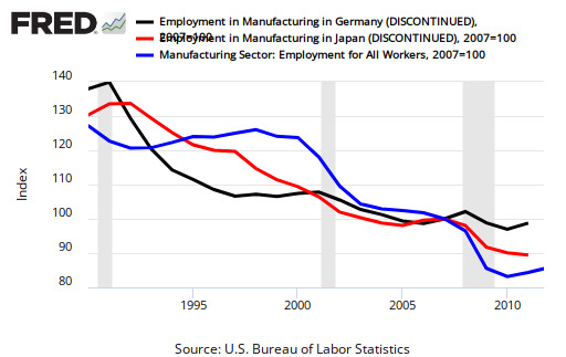
Above is a graph from the St. Louis Fed's excellent data portal which shows manufacturing employment in the US (blue), Germany (black) and Japan (red) from 1990 to 2010 (2011 for the US, note 100 = the series average over 1990 to 2010). The data clearly show that each of these three big manufacturing powerhouses have seen about the same proportional decline in manufacturing employment. Claims that Japan or Germany have not seen the same declines in manufacturing employment as the US are watching wiggles not trends.
The wiggles are important as they can represent the effects of policies aimed at reducing the impacts of recessions. But the trend is important as well, and seeing the same trend in manufacturing employment across three of the world's largest economies is pretty strong evidence that there is a single over-whelming dynamic at play - productivity growth in manufacturing.
I've been awarded an honorary doctorate from Linköping University in Sweden. I am very (!) appreciative of the award and look forward to continued collaborations with the excellent interdisciplinary research going on at LiU.
Roger Pielke, Jr., has been awarded an Honorary Doctor of Philosophy from Linköping University, one of Sweden's top universities that focuses on interdisciplinary research and teaching. He will travel to Sweden in late May to attend their graduation ceremonies and receive the award.
In awarding the degree Linköping noted Roger's "outstanding achievement in interdisciplinary climate research is a bold and refreshing voice in the climate debate. You have taken on public discussions with the IPCC, environmentalists as well as climate sceptics. You are profoundly committed to both use science to critically scrutinize policies and political decisions, and to deeply engage in finding ways of enhancing dialogues between science and policy."
However, in this post I simply want to address the overarching argument of the report that the experience of the past decade in the manufacturing sector has been -- as the title says -- worse than the Great Depression. This statement of the magnitude of the problem is thus the basis for arguing that policy actions are needed to protect manufacturing as a special sector in the economy. However, this overarching argument is hyperbole. It underscores the fact that ITIF has come to find itself on the wrong side of the innovation and manufacturing debate.
The figure at the top of this post helps to explain why the past decade is not particularly comparable to the Great Depression. The graph shows that while losses in manufacturing jobs were quite similar from 1929-1933 and 2000-2010, during the Depression the economy (inflation adjusted) contracted by 27% but during the latter period expanded by 18%!
One reason for this big difference is the much smaller role than manufacturing plays in today's modern economy. Almost by definition, manufacturing matters less to GDP and jobs than it once did. At the onset of the Great Depression, manufacturing was responsible for about 1 in every 3 non-farm jobs. Today, that number is more like 1 in 13.
The loss of manufacturing jobs is not unique to the US, as described by Mark Perry of the University of Michigan: "Australia's manufacturing/GDP ratio went from 22% in 1970 to 9.3% in 2010, Brazil's ratio went from 24.5% to 13.5%, Canada's from 19% to 10.5%, Germany's from 31.5% to 18.7%, and Japan's from 35% to 20%." These trends, I have and will argue, are the result of innovations that allow nations to get more output for less input.
A 2009 Congressional Research Service report (here in PDF and cited by ITIF) makes the case in more detail that the past decade is not comparable to the Great Depression:
There are substantial differences in the extent of unemployment during the Great Depression and the current recession. The unemployment rate rose almost eight-fold between 1929 (3.2%) and 1933 (24.9%). In contrast, it almost doubled between December 2007 (4.9%) and May 2009 (9.4%). At the peak of unemployment during the Great Depression (1933), one in four workers was unemployed, in contrast with fewer than one in eleven today. To approximate the pervasiveness of unemployment at the depth of the Depression, the number of workers without jobs would have to have totaled 38.6 million in May 2009, which is 24 million more workers than were unemployed this May (14.5 million).
Employers cut the total number of jobs on their payrolls much more deeply during the Great Depression than they have thus far in the latest recession. Between 1929 and 1933, employment on nonfarm payrolls fell by 24.3%, compared to 4.3% thus far in the recession. To approximate the relative extent of cutbacks that took place over the four-year period between 1929 and 1933, employers would have had to have shed 27.6 million more workers than they did between December 2007 and May 2009. In the goods-producing sector, 7.2 million rather than 3.0 million workers would have to have been laid off since the recession began to equal the relative impact of the four-year (1929-1933) decline. Within the goods-producing sector, construction companies would have had to have pared payrolls by 2.2 million more jobs than the 1.2 million positions cut through May 2009. Manufacturers would have had to have let go 2.5 million workers beyond the 1.8 million they displaced since December 2007 if the industry was in as relatively bad shape as it was in 1933.
The loss of manufacturing jobs over the past decade is not worse than the Great Depression, and that is a good thing, for the economy and for the future of American workers.
The Daisey case raises all sorts of interesting questions about journalism, but also more generally about the nature of argument, facts, data, persuasion and politics. For his part, Daisey sees little wrong in his fabrications, justifying them based on their political effect:
I am proud that my work seems to have sparked a growing storm of
attention and concern over the often appalling conditions under which
many of the high-tech products we love so much are assembled in China.
Part of the strength of Daisey's reporting was the simple narrative that he presented, with good guys and bad guys, leaving little room for complexity or nuance. Writing at Reuters, Felix Salmon says that this itself should have been a tip off:
Real life is messy. And as a general rule, the more theatrical the story
you hear, and the more it divides the world into goodies vs baddies,
the less reliable that story is going to be.
But some people do feel that certain issues are so important that there should be cause in political debates to overlook lies or misrepresentations in service of a "larger truth" (Yellow cake, anyone?). I have seen this attitude for years in the climate change debate (hey look, just today), and often condoned by scientists and journalists alike.
I even wrote about this problem back in 2001 when I was invited by the National Academy of Sciences to be among a small group of experts to brief several Senators and the new Secretary of Treasury:
As I prepared for the Senate Forum a number of colleagues expressed
concern that my work might be used (or misused) in the political
process to support particular positions. In a nutshell, my position,
shared with a number of colleagues, is that the "global warming:
yes or no?" debate has become an obstacle to effective policy action
related to climate.
Several of these colleagues suggested that I should downplay the policy
implications of my work showing that for a range of phenomena and places,
future climate impacts depend much more on growing human vulnerability
to climate than on projected changes in climate itself (under the
assumptions of the Intergovernmental Panel on Climate Change).
One colleague wrote, "I think we have a professional (or moral?)
obligation to be very careful what we say and how we say it when the
stakes are so high." In effect, some of these colleagues were
intimating that ends justify means or, in other words, doing the
"right thing" for the wrong reasons is OK.
. . . I likened this situation
to the following hypothetical. Imagine that as policy makers are
debating intervening militarily in a foreign country, the media report
that 1,000 women and children were brutally murdered in that country.
This report inflames passions and provides a very compelling
justification for the military intervention. A journalist discovers
that, contrary to the earlier reports, only 10 soldiers died. What
is the journalist's obligation to report the "truth" knowing full
well that it might affect political sentiments that were shaped by
the earlier erroneous report? When science is used (and misused) in
political advocacy, there are frequent opportunities for such
situations to arise.
The Mike Daisey case ought to prompt some soul-searching among scientists (who seek to communicate to the public and policy makers) and journalists more generally, as the issues implicated by his fabrications are far more common than many would like to admit.
[UPDATE: Jeff Masters graciously responded to my email invitation to comment with this reply just received by email:
Hi Roger, thanks for the note. As you point out, my discussion of Bouwer's excellent paper was too short and potentially misleading. When I discuss his paper in the future, I will include the sentence,
"Studies that did find increases after normalization did not fully correct for wealth and population increases, or they identified other sources of exposure increases or vulnerability changes or changing environmental conditions. No study identified changes in extreme weather due to anthropogenic climate change as the main driver for any remaining trend."
Masters (mis)characterizes a 2011 literature review by Laurens Bouwer as follows:
A 2010 paper in the Bulletin of the American Meteorological Society by Netherlands researcher Laurens Bouwer titled, “Have Disaster Losses Increased Due to Anthropogenic Climate Change?”, looked at 22 disaster-loss studies worldwide, published between 2001 and 2010 All of the studies showed an increase in damages from weather-related disasters in recent decades. Fourteen of the 22 studies concluded that there were no trends in damage after correcting for increases in wealth and population, while eight of the studies did find upward trends even after such corrections, implying that climate change could be responsible for the increased disaster losses.
Does Bouwer conclude that eight of those studies actually "[imply] that climate change could be responsible for the increased disaster losses"? Actually, no. Bouwer concludes exactly the opposite to what Masters attributes to his paper.
And here is what Bouwer actually says (here in PDF):
Studies that did find increases after normalization did not fully correct for wealth and population increases, or they identified other sources of exposure increases or vulnerability changes or changing environmental conditions. No study identified changes in extreme weather due to anthropogenic climate change as the main driver for any remaining trend.
Here is what Bouwer concludes on the full set of 22 papers that he reviewed :
The studies show no trends in losses, corrected for changes (increases) in population and capital at risk, that could be attributed to anthropogenic climate change. Therefore, it can be concluded that anthropogenic climate change so far has not had a significant impact on losses from natural disasters.
It is of course perfectly acceptable for people to challenge data and analyses on the possible relationship of human-caused climate change and disaster losses, and ideally they will do so in the academic literature. But when existing peer-reviewed studies are fundamentally misrepresented in popular discussions, no one's interests are served.
Writing in the journal Psychological Science, Simmons et al. (2011, here in PDF) identify a problem in the psychological literature which they call "false positive psychology." They describe this phenomenon as follows:
Our job as scientists is to discover truths about the world. We generate hypotheses, collect data, and examine whether or not the data are consistent with those hypotheses. Although we aspire to always be accurate, errors are inevitable.
Perhaps the most costly error is a false positive, the incorrect rejection of a null hypothesis. First, once they appear in the literature, false positives are particularly persistent. Because null results have many possible causes, failures to replicate previous findings are never conclusive. Furthermore, because it is uncommon for prestigious journals to publish null findings or exact replications, researchers have little incentive to even attempt them. Second, false positives waste resources: They inspire investment in fruitless research programs and can lead to ineffective policy changes. Finally, a field known for publishing false positives risks losing its credibility.
In this article, we show that despite the nominal endorsement of a maximum false-positive rate of 5% (i.e., p ≤ .05), current standards for disclosing details of data collection and analyses make false positives vastly more likely. In fact, it is unacceptably easy to publish “statistically significant” evidence consistent with any hypothesis.
Why does this phenomenon occur?
The culprit is a construct we refer to as researcher degrees of freedom. In the course of collecting and analyzing data, researchers have many decisions to make: Should more data be collected? Should some observations be excluded? Which conditions should be combined and which ones compared? Which control variables should be considered? Should specific measures be combined or transformed or both?
It is rare, and sometimes impractical, for researchers to make all these decisions beforehand. Rather, it is common (and accepted practice) for researchers to explore various analytic alternatives, to search for a combination that yields “statistical significance,” and to then report only what “worked.” The problem, of course, is that the likelihood of at least one (of many) analyses producing a falsely positive finding at the 5% level is necessarily greater than 5%.
This exploratory behavior is not the by-product of malicious intent, but rather the result of two factors: (a) ambiguity in how best to make these decisions and (b) the researcher’s desire to find a statistically significant result. A large literature documents that people are self-serving in their interpretation of ambiguous information and remarkably adept at reaching justifiable conclusions that mesh with their desires (Babcock & Loewenstein, 1997; Dawson, Gilovich, & Regan, 2002; Gilovich, 1983; Hastorf & Cantril, 1954; Kunda, 1990; Zuckerman, 1979). This literature suggests that when we as researchers face ambiguous analytic decisions, we will tend to conclude, with convincing self-justification, that the appropriate decisions are those that result in statistical significance (p ≤ .05).
Ambiguity is rampant in empirical research.
The problem of "false positive science" is of course not limited to the discipline of psychology or even the social sciences. Simmons et al. provide several excellent empirical examples of how ambiguity in the research process leads to false positives and offer some advice for how the research community might begin to deal with the problem.
Compounding this problem with psychological science is the pathetic state of science reporting: the problem of how unacceptably easy it is to publish total fictions about science, and falsely claim relevance to real everyday life.
Pullam provides a nice example of the dynamics discussed here in the recent case of the so-called "QWERTY effect" which is also dissected here. On this blog I've occasionally pointed to silly science and silly reporting, as well as good science and good reporting -- which on any given topic is all mixed up together.
When prominent members of the media take on an activist bent, the challenge is further compounded. Of course, members of the media are not alone in their activism through science. The combination of ambiguity, researcher interest in a significant result and research as a tool of activism makes sorting through the thicket of knowledge a challenge in the best of cases, and sometimes just impossible.
The practical conclusion to draw from Simmons et al. is that much of what we think we know based on conventional statistical studies published in the academic literature stands a good chance of just not being so -- certainly more than the 5% threshold used as a threshold for significance. Absent solid research, we simply can't distinguish empirically between false and true positives, meaning that we apply other criteria, like political expediency. Knowing what to know turns out to be quite a challenge.
ManpowerGroup has just released their latest employment outlook survey looking to the next quarter (April-May-June). In the graph above I show the report's numbers for companies in the US expecting to hire more employees over the next three months (calculated as the percent expecting to add minus the percent expecting to cut, US data here in PDF).
A few weeks ago, Sir Paul Nurse, president of the Royal Society and Nobel Laureate, gave the Richard Dimbleby Lecture for the BBC (here in PDF). In it he presented a rather simplistic and two-dimensional picture of the relationship of science and decision making.
He first conflates scientific judgments with judgments about action:
It is impossible to achieve complete certainty on many complex scientific problems, yet sometimes we still need to take action. The sensible course is to turn to the expert scientists for their consensus view. When doctors found I had blockages in the arteries around my heart I asked them for their expert view as to what I should do. They recommended a bypass, I took their consensus advice, and here I am. That is how science works.
As the doctor metaphor is a common one in this context, I have written about it on numerous occasions to illustrate that consulting a medical expert is not as simple as the patient doing whatever the doctor says. For instance, here is what I wrote in The Climate Fix (p. 215):
So your child is sick and you take him to the doctor. How might the doctor best serve the parent’s decisions about the child? The answer depends on the context.
If you feel that you can gain the necessary expertise to make an informed decision, you might consult peer-reviewed medical journals (or a medical Web site) to understand treatment options for your child instead of directly interacting with a doctor.
If you are well informed about your child’s condition and there is time to act, you might engage in a back-and-forth exchange with the doctor, asking her questions about the condition and the effects of different treatments.
If your child is deathly ill and action is needed immediately, you might ask the doctor to make whatever decisions are deemed necessary to save your child’s life, without including you in the decision-making process.
If there is a range of treatments available with different possible outcomes, you might ask the doctor to spell out the entire range of treatment options and their likely consequences to inform your decision.
Even in the superficially simple scenario of a doctor, a parent and child, it’s clear that the issues are complicated. Understanding the different forms of this relationship is the first step toward the effective governance of expertise.
Nurse asserts that we must resolve science questions prior to resolving political questions:
Today the world faces major problems. Some uppermost in my mind are food security, climate change, global health and making economies sustainable, all of which need science. It is critical for our democracy to have mature discussions about these issues. But these debates are sometimes threatened by a misinformed sense of balance and inappropriate headlines in the media, which can give credence to views not supported by the science, and by those who distort the science with ideology, politics, and religion.
From the very beginning of science there have always been such threats. When Galileo argued that the earth orbited the sun, the Inquisition did not argue back with science, they simply showed him the instruments of torture. It is very important that we keep such influences separate from scientific debate. The time for politics is after the science not before.
Nurse chooses (unwisely) to illustrate his point with genetically modified crops:
It is time to reopen the debate about GM crops in the UK but this time based on scientific facts and analysis. We need to consider what the science has to say about risks and benefits, uncoloured by commercial interests and ideological opinion. It is not acceptable if we deny the world’s poorest access to ways that could help their food security, if that denial is based on fashion and ill-informed opinion rather than good science.
Good luck separating science and politics in that debate, much less getting the science before the politics! Debates over GM crops at times involve questions that might be resolved through the tools of science, but more often, such debates involve questions of values grafted on to issues of risk and benefits, as if science might resolve them.
Nurse ends his speech with a passionate and conventional plea for more government support for science and more autonomy for researchers:
We need more science in Government, the boardroom, and public services, we need more funding for science, we need greater engagement with the public and a society comfortable with science, we need to convey the wonder of science, and what it contributes to our culture and our civilization.
But other than broad generalities, he does not address what science is needed (all of it I suppose), how it is to be paid for or what returns ought to be expected. Such hand waving is of course common place in science policy debates.
In an editorial last week, Nature politely took issue with Nurse's arguments about the relationship of science and society, and offered a somewhat more nuanced extension and re-characterization of Nurse's remarks:
[A]lthough political (and religious) ideology has no place in deciding scientific questions, the practice of science is inherently political. In that sense, science can never come before politics. Scientists everywhere enter into a social contract, not least because they are not their own paymasters. Much, if not most, scientific research has social and political implications, often broadly visible from the outset. In times of crisis (like the present), scientists must respond intellectually and professionally to the challenges facing society, and not think that safeguarding their funding is enough.
The consequences of imagining that science can remain aloof from politics became acutely apparent in Germany in 1933, when the consensus view that politics was, as Heisenberg put it, an unseemly “money business” meant that most scientists saw no reason to mount concerted resistance to the expulsion of Jewish colleagues — regarded as a political rather than a moral matter. This 'apolitical' attitude can now be seen as a convenient myth that led to acquiescence in the Nazi regime and made it easy for German scientists to be manipulated. It would be naive to imagine that only totalitarianism could create such a situation.
The rare and most prominent exception to apolitical behaviour was Einstein, whose outspokenness dismayed even his principled friends the German physicists Max Planck and Max von Laue. “I do not share your view that the scientist should observe silence in political matters,” he told them. “Does not such restraint signify a lack of responsibility?” There was no hint of such a lack in Nurse's talk. But we must take care to distinguish the political immunity of scientific reasoning from the political dimensions and obligations of doing science.
[UPDATE 3/14: To get a sense of how the game is played by climate scientists -- and they do indeed treat it like a game -- see this query of mine to Richard Somerville asking about comments attributed to him and his response.]
In December I was contacted by a journalist named Christine MacDonald who wanted to ask me a few questions about extreme events and climate change:
Hi Prof. Pielke,
I am writing an article for E Magazine on
climate change and extreme weather. I read about your concerns that
some scientists are overstating the connections between hurricanes,
cyclones and some other weather events and climate change. I wanted to
ask you what you think of
Kevin Trenberth's proposal about shifting the burden of proof so that we
assume climate change is involved in all usual events unless proven
otherwise.
I chatted with her, giving what is by now a very familiar set of points related to a wide range of peer-reviewed science, including the most recent IPCC SREX report. She responded with this email to check quotes:
Hi Roger,
Here's what I was going to use. Please take a close look, particularly at this part: events such heatwaves,
droughts, floods and hurricanes. Is that accurate to your views? if not please let me know and I will fix.
“It stretches the science to the point of breaking and
provides skeptics with fuel. So why go there?” says Pielke of his colleagues
efforts to discern global warming “fingerprints” on events such heatwaves,
droughts, floods and hurricanes.
“It’s more of rhetorical interest than anything scientific,”
Peilke says of Trenberth’s proposal. “The science is not there because if it
were he’d be making the case with numbers.”
Thanks.
Christine
I responded with the following clarifications:
Thanks Christine ... two very important changes (delete between stars):
--------------------------
“It stretches the science to the point of breaking and
provides skeptics with fuel. So why go there?” says Pielke of ***DELETEhis colleagues****
efforts to discern global warming “fingerprints” on RECENT INDIVIDUAL events such heatwaves,
droughts, floods and hurricanes.
“It’s more of rhetorical interest than anything scientific,”
Peilke says of Trenberth’s proposal. “The science is not there because if it
were he’d be making the case with numbers.”
---------------------------
Explanation:
1.
It is not my colleagues efforts (maybe one or two, but the current
phrasing is too broad a brush) but mainly political advocates and
certain media ...
2. The issue is not with the longer-term climate time scale studies
(over 30-50 years and longer) but with attribution of specific events
One obstacle to exactitude is that extreme events, by their very nature, are infrequent and leave few clues for scientists to follow, says Kevin Trenberth, senior scientist at the National Center for Atmospheric Research. Trenberth caused a stir last year by suggesting that the time had come to flip the burden of proof and assume climate change plays a role in all weather today.
“Of course there is large weather and natural variability. And even with climate change, most of the time it falls within the bounds of previous experience. But increasingly it doesn’t, and records are being broken that are consistent with a human influence of warming,” he wrote in an e-mail exchange
It’s a controversial idea that has attracted criticism from other climate scientists and has been assailed by climate deniers and a few prominent bloggers like Roger Pielke, Jr.
“It’s more of a rhetorical question than anything scientific,” says Pielke, a professor of environmental studies at the Center for Science and Technology Policy Research at the University of Colorado at Boulder.
Pielke, a darling of the denialist community for his criticism of Al Gore, Trenberth and others, has accused climate scientists of overreaching to make weather-climate change connections, allegations that have annoyed Somerville and other top scientists who consider Pielke, a political scientist, an unqualified gadfly on matters of climate science.
Apparently Ms. MacDonald is a follower of the "don't tell the whole truth" school of environmental journalism ;-)
Regardless of one's economic philosophy, the public deserves an accurate
presentation of the reasons for the change in income distribution. The
change is occurring in all the developed countries. The chart shows that
policies that redistribute wealth and income have at most a modest
effect on income shares.
While he is correct that gross trends are similar across countries, he underplays the rather remarkable acceleration of income share captured by the top 1% of earners in the United States, which has continued since the end of the data period shown in the graph. Is that acceleration a function of policy decisions? Of course. On that point Metzler is letting his economic philosophy speak rather than looking closely at what the graph actually suggests.
Continuing the ongoing discussion of gasoline prices and the economy, the figure above shows gasoline expenditures as a fraction of personal consumption expenditures for 1959 through 2011 (Data: BEA). You can see that gasoline ended 2011 at about the 4% level. Gasoline spending was actually higher in September 2011 (4.1%) than in December (3.8%). The increase of 1% -- from 2.8% in May 2009 to 3.8% in December 2011 -- coincided with a 70% increase in the price of gasoline (data: BLS).
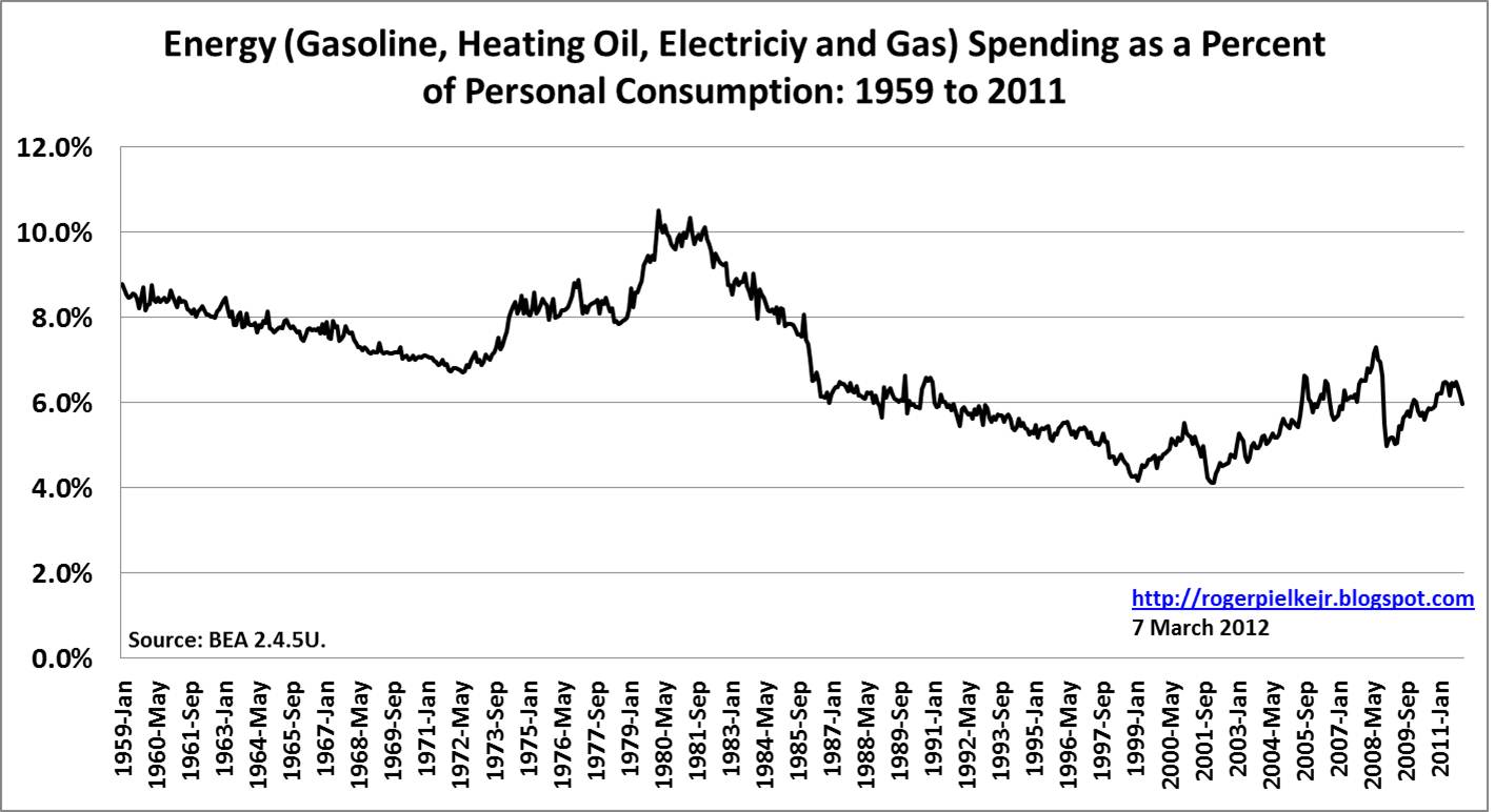
The graph below shows total energy spending (where energy is defined as the sum of expenditures on gasoline, heating oil, electricity and natural gas) from 1959 through 2011, and it shows that total energy spending is just under 6% of personal consumption expenditures. To some degree, higher priced gasoline has been offset by lower spending on heating oil and electricity.
The third graph, below, shows gasoline spending as a percent of total personal energy consumption expenditures. The graph shows a remarkable degree of consistency over many decades with gasoline comprising between 50% and 60% of total energy expenditures. Gasoline has increased above the 60% threshold as gasoline prices have increased and other energy expenditures have remained constant or declined.
So what does all of this data mean? Here is my interpretation:
1. The US economy is not yet in a danger zone with respect to gasoline prices -- $4 dollar per gallon gasoline is not what it used to be. What would it take for gasoline to exceed 5%, 6% or more of personal consumption expenditures? It is not easy to answer with any confidence, but if the increase in price of $1.50 per gallon or 70% from May, 2009 to September, 2011 resulted in an increase in personal gasoline consumption expenditures of 1%, then assuming linearity (caution: rarely a good assumption, but lets play around), then we'd have to see gasoline prices of more than $5 per gallon to reach that 5% threshold. There are good reasons to think that such an outcome is not imminent.
2. The overall impact of gasoline prices is somewhat muted in the context of total energy expenditures because of the falling price of natural gas. To the extent that natural gas can replace gasoline (not easy in the short term) this trend will be accelerated. Meantime, consumers will see a bit of an offsetting balance in their total energy expenditures due to lower electricity and gas prices. A hot summer could easily lead to increased expenditures as air conditioning is cranked up, and summer is traditionally when there is more demand for gasoline.
3. Why did things appear to change in US gasoline spending starting 2002? My guess is China, which joined the WTO in 2002 and subsequently saw its oil consumption increase by almost 90% from 2002 to 2010, a period of remarkable economic growth. Over the same time period the United States saw its oil consumption decline by more than 3% (Data: BP). Such trends are likely to continue, making it more important for the US to reduce the gasoline intensity of its economy and/or develop new resources. The pressure to drip and pipe will only increase.
4. In the context of such trends, it should be a matter of policy to seek to reduce the share of economic activity expended on gasoline in particular and energy in general. The good news is that there does seem to be a consensus, even in these most partisan of times, on what makes for a common sense energy policy -- The Economist makes a good start.
Here is President Obama just yesterday responding to a Fox News reporter who asked if he really -- deep down inside -- wants to see gasoline prices go higher. The President responds with his verison of the iron law:
[UPDATE 3/7: In a move rather ironic given this post, Michael Mann writes on his Facebook page that I have "teamed up" with Marc Morano to produce a "dishonest smear." How have I "teamed up" with Morano? Apparently Morano linked to this post. Mann appears challenged with the truth.
Also, on Twitter (gotta follow lots of media these days) Mann suggests that his advocacy for the Hockey Stick was in one part of the IPCC report not another. My reply -- So what? The Gillis NYT article mentioned and linked to the entire IPCC report. In how many places was the Hockey Stick featured in the 2001 IPCC report? At least in 6 places (PDF).]
Yesterday, Michael Lemonick asked of journalists at Climate Central, "should we tell the whole truth about climate change?" His answer is to ask "So where’s the right balance between telling the whole truth and being truthful in an effective way?" (have a look at the link title as well). For some journalists a desire for "effectiveness" trumps "truth."
Journalists, like everyone else, have their biases and perspectives. And on the issue of climate change journalists are as prone as any of us to the seductive siren of tribalism, with good guys on one side and evil ones on the other. But does this framing actually serve the interests of the broader climate science community? I think not.
Gillis writes of the so-called "hockey stick" graph produced by Mann and highlighted by the IPCC in its 2001 report (emphasis added):
The graph
of reconstructed temperatures is called a hockey stick because the
right-hand side shows temperatures veering sharply upward in the last
century. The paper and its graph, along with subsequent studies by Dr.
Mann and several other scientists, suggest that this recent warming is
anomalous, at least over the past millennium. Through no choice of Dr.
Mann’s, the graph became a symbol of modern climate science when it was
featured prominently in a 2001 report by a United Nations panel.
Now you don't have to be a climate insider to know that Mann was in fact actively involved in promoting his own graph to be featured by the IPCC in its 2001 report. and that Gillis' statement is flat out wrong. You don't have to believe me (or Steve McIntyre, who Gillis denigrates but does not cite by name), but Mann himself. Mann was unequivocally a vigorous advocate within the IPCC promoting his own work. When the NYT gets such a basic fact wrong it not only makes them look bad, but has collateral damage for the climate science community.
The realities of the most intensely contested aspects of the climate debate are that there are human beings on both sides -- complex, contradictory, red-blooded, imperfect human beings. When the media places scientists up on a pedestal and does so via the spinning of untruths, they simply set the stage for a bigger fall when the scientists cannot live up to their adulatory press coverage. And besides, many of us know better. The media should cover science in three dimensions, and eschew the two-dimensional fiction of good vs. evil, even if that means exploring nuance and contradiction.


